17 KiB
| documentclass | title | author | pandoc-options | header-includes | ||||
|---|---|---|---|---|---|---|---|---|
| usiinfbachelorproject | Understanding and Comparing Unsuccessful Executions in Large Datacenters | Claudio Maggioni |
|
|
\tableofcontents \newpage
Introduction (including Motivation)
State of the Art
Introduction
TBD
Rosà et al. 2015 DSN paper
In 2015, Dr. Andrea Rosà, Lydia Y. Chen, Prof. Walter Binder published a research paper titled "Understanding the Dark Side of Big Data Clusters: An Analysis beyond Failures" performing several analysis on Google's 2011 Borg cluster traces. The salient conclusion of that research is that lots of computation performed by Google would eventually fail, leading to large amounts of computational power being wasted.
Our aim with this thesis is to repeat the analysis performed in 2015 on the new 2019 dataset to find similarities and differences with the previous analysis, and ulimately find if computational power is indeed wasted in this new workload as well.
Google Borg
Borg is Google's own cluster management software. Among the various cluster management services it provides, the main ones are: job queuing, scheduling, allocation, and deallocation due to higher priority computations.
The data this thesis is based on is from 8 Borg "cells" (i.e. clusters) spanning 8 different datacenters, all focused on "compute" (i.e. computational oriented) workloads. The data collection timespan matches the entire month of May 2019.
In Google's lingo a "job" is a large unit of computational workload made up of several "tasks", i.e. a number of executions of single executables running on a single machine. A job may run tasks sequentially or in parallel, and the condition for a job's succesful termination is nontrivial.
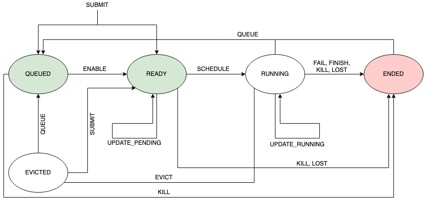
Both tasks and jobs lifecyles are represented by several events, which are encoded and stored in the trace as rows of various tables. Among the information events provide, the field "type" provides information on the execution status of the job or task. This field can have the following values:
- QUEUE: The job or task was marked not eligible for scheduling by Borg's scheduler, and thus Borg will move the job/task in a long wait queue;
- SUBMIT: The job or task was submitted to Borg for execution;
- ENABLE: The job or task became eligible for scheduling;
- SCHEDULE: The job or task's execution started;
- EVICT: The job or task was terminated in order to free computational resources for an higher priority job;
- FAIL: The job or task terminated its execution unsuccesfully due to a failure;
- FINISH: The job or task terminated succesfully;
- KILL: The job or task terminated its execution because of a manual request to stop it;
- LOST: It is assumed a job or task is has been terminated, but due to missing data there is insufficent information to identify when or how;
- UPDATE_PENDING: The metadata (scheduling class, resource requirements, ...) of the job/task was updated while the job was waiting to be scheduled;
- UPDATE_RUNNING: The metadata (scheduling class, resource requirements, ...) of the job/task was updated while the job was in execution;
Figure \ref{fig:eventTypes} shows the expected transitions between event types.
Traces contents
The traces provided by Google contain mainly a collection of job and task events spanning a month of execution of the 8 different clusters. In addition to this data, some additional data on the machines' configuration in terms of resources (i.e. amount of CPU and RAM) and additional machine-related metadata.
Due to Google's policy, most identification related data (like job/task IDs, raw resource amounts and other text values) were obfuscated prior to the release of the traces. One obfuscation that is noteworthy in the scope of this thesis is related to CPU and RAM amounts, which are expressed respetively in NCUs (Normalized Compute Units) and NMUs (Normalized Memory Units).
NCUs and NMUs are defined based on the raw machine resource distributions of the machines within the 8 clusters. A machine having 1 NCU CPU power and 1 NMU memory size has the maximum amount of raw CPU power and raw RAM size found in the clusters. While RAM size is measured in bytes for normalization purposes, CPU power was measured in GCU (Google Compute Units), a proprietary CPU power measurement unit used by Google that combines several parameters like number of processors and cores, clock frequency, and architecture (i.e. ISA).
Overview of traces' format
The traces have a collective size of approximately 8TiB and are stored in a Gzip-compressed JSONL (JSON lines) format, which means that each table is represented by a single logical "file" (stored in several file segments) where each carriage return separated line represents a single record for that table.
There are namely 5 different table "files":
machine_configs, which is a table containing each physical machine's configuration and its evolution over time;instance_events, which is a table of task events;collection_events, which is a table of job events;machine_attributes, which is a table containing (obfuscated) metadata about each physical machine and its evolution over time;instance_usage, which contains resource (CPU/RAM) measures of jobs and tasks running on the single machines.
The scope of this thesis focuses on the tables machine_configs,
instance_events and collection_events.
Remark on traces size
While the 2011 Google Borg traces were relatively small, with a total size in
the order of the tens of gigabytes, the 2019 traces are quite challenging to
analyze due to their sheer size. As stated before, the traces have a total size
of 8 TiB when stored in the format provided by Google. Even when broken down to
table "files", unitary sizes still reach the single tebibyte mark (namely for
machine_configs, the largest table in the trace).
Due to this constraints, a careful data engineering based approach was used when reproducing the 2015 DSN paper analysis. Bleeding edge data science technologies like Apache Spark were used to achieve efficient and parallelized computations. This approach is discussed with further detail in the following section.
Project requirements and analysis
TBD (describe our objective with this analysis in detail)
Analysis methodology
TBD
Introduction on Apache Spark
Apache Spark is a unified analytics engine for large-scale data processing. In layman's terms, Spark is really useful to parallelize computations in a fast and streamlined way.
In the scope of this thesis, Spark was used essentially as a Map-Reduce framework for computing aggregated results on the various tables. Due to the sharded nature of table "files", Spark is able to spawn a thread per file and run computations using all processors on the server machines used to run the analysis.
Spark is also quite powerful since it provides automated thread pooling services, and it is able to efficiently store and cache intermediate computation on secondary storage without any additional effort required from the data engineer. This feature was especially useful due to the sheer size of the analyzed data, since the computations required to store up to 1TiB of intermediate data on disk.
The chosen programming language for writing analysis scripts was Python. Spark has very powerful native Python bindings in the form of the PySpark API, which were used to implement the various queries.
Query architecture
In general, each query follows a general Map-Reduce template, where traces are first read, parsed, filtered by performing selections, projections and computing new derived fields. Then, the trace records are often grouped by one of their fields, clustering related data toghether before a reduce or fold operation is applied to each grouping.
Most input data is in JSONL format and adheres to a schema Google profided in the form of a protobuffer specification1.
On of the main quirks in the traces is that fields that have a "zero" value (i.e. a value like 0 or the empty string) are often omitted in the JSON object records. When reading the traces in Apache Spark is therefore necessary to check for this possibility and populate those zero fields when omitted.
Most queries use only two or three fields in each trace records, while the original records often are made of a couple of dozen fields. In order to save memory during the query, a projection is often applied to the data by the means of a .map() operation over the entire trace set, performed using Spark's RDD API.
Another operation that is often necessary to perform prior to the Map-Reduce core of each query is a record filtering process, which is often motivated by the presence of incomplete data (i.e. records which contain fields whose values is unknown). This filtering is performed using the .filter() operation of Spark's RDD API.
The core of each query is often a groupBy followed by a map() operation on the aggregated data. The groupby groups the set of all records into several subsets of records each having something in common. Then, each of this small clusters is reduced with a .map() operation to a single record. The motivation behind this computation is often to analyze a time series of several different traces of programs. This is implemented by groupBy()-ing records by program id, and then map()-ing each program trace set by sorting by time the traces and computing the desired property in the form of a record.
Sometimes intermediate results are saved in Spark's parquet format in order to compute and save intermediate results beforehand.
General Query script design
TBD
Ad-Hoc presentation of some analysis scripts
TBD (with diagrams)
Analysis and observations
Overview of machine configurations in each cluster
\input{figures/machine_configs}
Refer to figure \ref{fig:machineconfigs}.
Observations:
- machine configurations are definitely more varied than the ones in the 2011 traces
- some clusters have more machine variability
Analysis of execution time per each execution phase
\input{figures/machine_time_waste}
Refer to figures \ref{fig:machinetimewaste-abs} and \ref{fig:machinetimewaste-rel}.
Observations:
- Across all cluster almost 50% of time is spent in "unknown" transitions, i.e. there are some time slices that are related to a state transition that Google says are not "typical" transitions. This is mostly due to the trace log being intermittent when recording all state transitions.
- 80% of the time spent in KILL and LOST is unknown. This is predictable, since both states indicate that the job execution is not stable (in particular LOST is used when the state logging itself is unstable)
- From the absolute graph we see that the time "wasted" on non-finish terminated jobs is very significant
- Execution is the most significant task phase, followed by queuing time and scheduling time ("ready" state)
- In the absolute graph we see that a significant amount of time is spent to re-schedule evicted jobs ("evicted" state)
- Cluster A has unusually high queuing times
Task slowdown
\input{figures/task_slowdown}
Refer to figure \ref{fig:taskslowdown}
Observations:
- Priority values are different from 0-11 values in the 2011 traces. A conversion table is provided by Google;
- For some priorities (e.g. 101 for cluster D) the relative number of finishing task is very low and the mean slowdown is very high (315). This behaviour differs from the relatively homogeneous values from the 2011 traces.
- Some slowdown values cannot be computed since either some tasks have a 0ns execution time or for some priorities no tasks in the traces terminate successfully. More raw data on those exception is in Jupyter.
- The % of finishing jobs is relatively low comparing with the 2011 traces.
Reserved and actual resource usage of tasks
\input{figures/spatial_resource_waste}
Refer to figures \ref{fig:spatialresourcewaste-actual} and \ref{fig:spatialresourcewaste-requested}.
Observations:
- Most (mesasured and requested) resources are used by killed job, even more than in the 2011 traces.
- Behaviour is rather homogeneous across datacenters, with the exception of cluster G where a lot of LOST-terminated tasks acquired 70% of both CPU and RAM
Correlation between task events' metadata and task termination
\input{figures/figure_7}
Refer to figures \ref{fig:figureVII-a}, \ref{fig:figureVII-b}, and \ref{fig:figureVII-c}.
Observations:
- No smooth curves in this figure either, unlike 2011 traces
- The behaviour of curves for 7a (priority) is almost the opposite of 2011, i.e. in-between priorities have higher kill rates while priorities at the extremum have lower kill rates. This could also be due bt the inherent distribution of job terminations;
- Event execution time curves are quite different than 2011, here it seems there is a good correlation between short task execution times and finish event rates, instead of the U shape curve in 2015 DSN
- In figure \ref{fig:figureVII-b} cluster behaviour seems quite uniform
- Machine concurrency seems to play little role in the event termination distribution, as for all concurrency factors the kill rate is at 90%.
Correlation between task events' resource metadata and task termination
Correlation between job events' metadata and job termination
\input{figures/figure_9}
Refer to figures \ref{fig:figureIX-a}, \ref{fig:figureIX-b}, and \ref{fig:figureIX-c}.
Observations:
- Behaviour between cluster varies a lot
- There are no "smooth" gradients in the various curves unlike in the 2011 traces
- Killed jobs have higher event rates in general, and overall dominate all event rates measures
- There still seems to be a correlation between short execution job times and successfull final termination, and likewise for kills and higher job terminations
- Across all clusters, a machine locality factor of 1 seems to lead to the highest success event rate
Mean number of tasks and event distribution per task type
\input{figures/table_iii}
Refer to figure \ref{fig:tableIII}.
Observations:
- The mean number of events per task is an order of magnitude higher than in the 2011 traces
- Generally speaking, the event type with higher mean is the termination event for the task
- The # evts mean is higher than the sum of all other event type means, since it appears there are a lot more non-termination events in the 2019 traces.
Mean number of tasks and event distribution per job type
\input{figures/table_iv}
Refer to figure \ref{fig:tableIV}.
Observations:
- Again the mean number of tasks is significantly higher than the 2011 traces, indicating a higher complexity of workloads
- Cluster A has no evicted jobs
- The number of events is however lower than the event means in the 2011 traces
Probability of task successful termination given its unsuccesful events
\input{figures/figure_5}
Refer to figure \ref{fig:figureV}.
Observations:
- Behaviour is very different from cluster to cluster
- There is no easy conclusion, unlike in 2011, on the correlation between succesful probability and # of events of a specific type.
- Clusters B, C and D in particular have very unsmooth lines that vary a lot for small # evts differences. This may be due to an uneven distribution of # evts in the traces.
Potential causes of unsuccesful executions
TBD
Implementation issues -- Analysis limitations
Discussion on unknown fields
TBD
Limitation on computation resources required for the analysis
TBD
Other limitations ...
TBD
Conclusions and future work or possible developments
TBD